

Amazon Graphic Design Services: What You’re Really Paying For
Great email design isn’t just a nice-to-have; it’s a game changer for your marketing campaign. If your emails aren’t pulling in the conversions, it might be time to take a hard look at their design—because, let’s face it, nobody’s clicking on a snooze-fest.
Most people’s inboxes are already pretty full—so how can you make your emails stand out? By employing creative email designs, you can increase your conversion rate, win over customers, and thrust your brand into the spotlight.
This post offers email design best practices and tips to help you craft captivating emails that burst with creativity and wield the power to persuade!
Make a Memorable First Impression with Your Email Designs
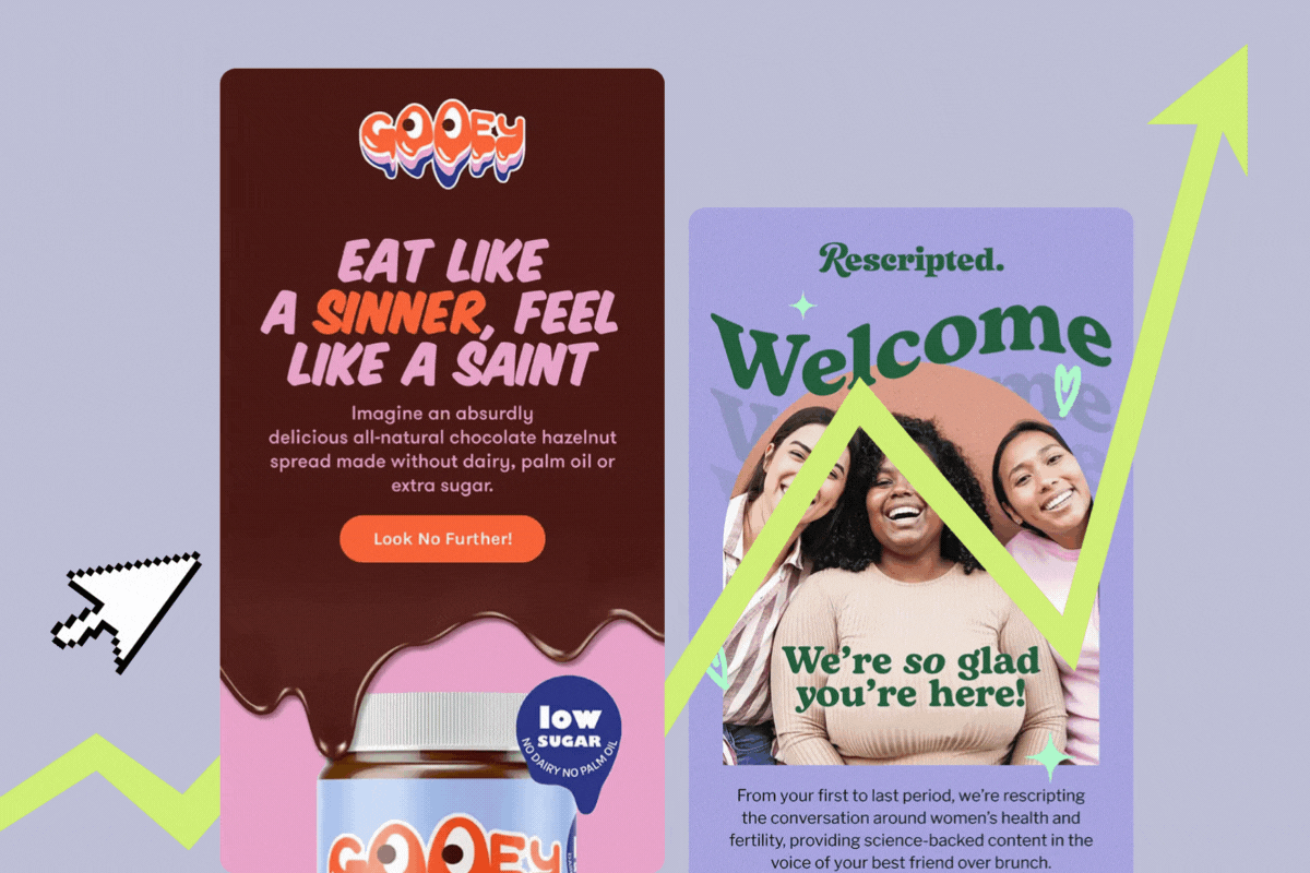
The first thing your audience will see is the “hero banner.” This is the block of text and image that appears at the top of your email.
Your email’s hero banner is prime real estate. It’s the digital equivalent of a first handshake, and you want it to be firm but not awkwardly long. This top section typically includes an image, headline, and call to action, and it sets the tone for everything that follows. A strong hero banner doesn’t just look pretty—it stops the scroll, delivers your key message, and nudges the reader toward action.
How to create a high-impact hero banner:
- Start with a compelling image: Think of your hero image as the hook that gets people to stay. It should spark an emotion—joy, curiosity, or FOMO—and align with your brand. If you're showcasing a product, make sure it’s the star of the show, not playing a blurry background extra.
- Craft a clear, benefit-driven headline: Your headline should be punchy and to the point—like a great elevator pitch but without the awkward small talk.
- Use a supporting subheading to add context: If the headline is the movie trailer, the subheading is the part where you decide whether it’s worth seeing. Use this space to provide a little more detail or urgency.
- Include a strong CTA to drive action: Your call to action should be clear and enticing, with no room for hesitation.

Optimize Your Email Designs for Mobile
Research has found that 81% of all email users check their inbox on cell phones rather than laptops, tablets, or other screens. Emails that are easy to read and look good are more likely to be noticed, so make sure your email designs reflect these principles.
Check out these email design tips to help you win over clients:
- Stick to a clean, single-column layout: A simple, uncluttered design ensures smooth scrolling and keeps readers focused without distraction.
- Choose easy-to-read fonts: Clear, legible typography makes your message pop instantly, even on tiny screens.
- Place your key message and CTA above the fold when you can: Readers spot the good stuff right away—no scrolling required to get hooked.
- Optimize images for quick loading: Fast, crisp visuals hold attention instead of losing readers to sluggish load times.
- Use large, thumb-friendly buttons: Big click zones make it a breeze for users to tap through, no fumbling needed.
- Test across different phones: Previewing on various devices guarantees your design shines for every recipient, no glitches allowed.

Pick Out Your Key Messages
Think about how you read your emails. We all receive too many emails a day to give each one our undivided attention. Most of us just spend a few seconds reading an email to find out whether it’s offering us important or useful information, so your key messages must stand out.
You may want to draw attention to a sale or special offer. Or it could be that your brand has reached a significant milestone or won an award. Pick out the single most important thing for readers of your email to know, and make sure your design enhances the message.
To highlight your message, you can:
- Create clear headlines and subheadings: Use different font sizes and weights to establish a clear structure in your email. The most important message should be the largest and most noticeable.
- Guide the reader through the email: Use visuals, arrows, or converting email layouts to naturally lead the reader from one section to the next, driving them towards each call-to-action.
- Position your message early: Place your most important message near the beginning of the email to catch the reader's eye.
- Stick to one or two key messages: Keep it simple to avoid overwhelming your reader and help them focus on what matters most.

Keep it Short and Sweet
No one wants to scroll through an epic saga just to find a discount code. Inboxes are crowded, attention spans are short, and let’s face it—most people are skimming, not reading. If your message doesn’t pop quickly, it might not get read at all.
Here’s how to keep your email design short, sweet, and easy to engage with:
- Catch attention early: Start with a striking image and a clear, compelling headline that speaks to the value of your message.
- Use preview text effectively: Summarize the main points of your email in the preview text to hook readers right away.
- Keep text short and scannable: Break up longer paragraphs into bullet points or short blocks of text to make it easier for readers to scan.
- Highlight key info: Use contrasting colors, bold text, or larger fonts to make important details stand out.
- Use visuals over words: Whenever possible, communicate your message with images to make your content more dynamic and easier to digest.

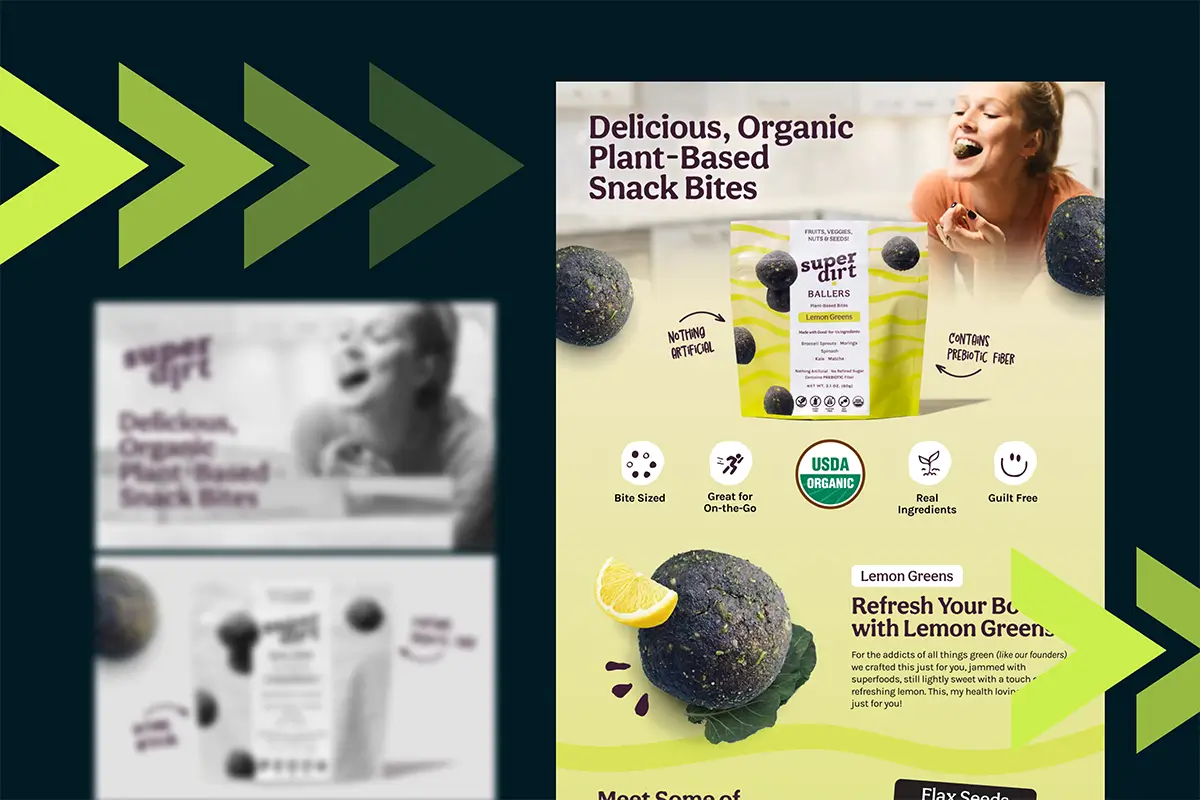
Clear Out the Clutter
As well as being to-the-point, your email design should be uncluttered and easy to read.
Here’s what you can do to achieve this:
- Limit the number of images: Use only a few carefully selected images to keep the focus on your message.
- Incorporate white space: Leave plenty of white space to create a clean, crisp look that enhances readability.
- Keep your color palette simple: Stick to three or four complementary colors to maintain a cohesive, uncluttered design.
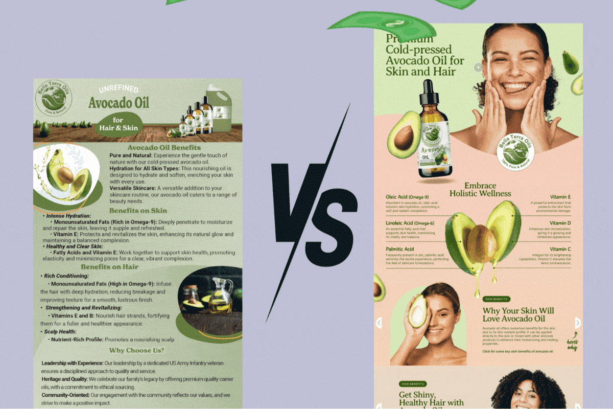
Make Your Email Visuals Stand Out
Invest time in mastering visual best practices to make your emails both engaging and easy to navigate. In email marketing, visuals are essential. Carefully selected, high-quality images can make your emails more captivating and memorable. These eye-catching visuals are often the key difference between an email that converts and one that gets overlooked.
Check out these rules for arresting visuals that lead to conversions:
- Resize your images for faster loading: Large image files can delay load times and frustrate your readers. Use a compression tool to reduce file size without compromising quality.
- Select high-quality images: Ensure they are clear, sharp, and free from pixelation.
- Add creative GIFs for engagement: Incorporating GIFs can add dynamic movement, capture attention, and make your emails more engaging without affecting load time significantly.
- Limit stock images: While stock images can be useful, try to avoid overusing them. If you do, make sure to edit them to align with your brand’s style and messaging.

Reflect Your Branding
Your email design should reflect your branding, which itself must be consistent across all your marketing materials and your entire online presence.
Keeping your brand consistent in your emails helps to build trust and recognition with your audience—and win conversions as a result.
Follow these ecommerce email design tips to reinforce your branding:
- Use your brand’s fonts and colors: Stick to the fonts and color palette that match your brand guidelines for visual consistency and accessibility.
- Place your logo prominently: Make sure your logo is clearly visible in the email so recipients instantly recognize who it’s from.
- Stay consistent with your tone of voice: Use language that reflects your brand’s personality, helping create a cohesive experience across all communications.

Use the Psychology of Color for Creative Email Designs
Color is a central element of nice email designs that appeal to readers and lead to conversions.
Sure, it’s important to include your existing branding colors in your design. You can also play around with other palettes and use the psychology of color to elicit certain emotions.
- Red, yellow, and neon shades: These colors grab attention and can create a sense of urgency.
- Blue and green shades: Known for their calming effect, blue and green are also great choices for nature-inspired products or services.
- Black, white, and navy blue: These colors are associated with luxury and high quality.
- Orange, yellow, and red: These invigorating colors can energize and motivate action.
You should also consider how contrasting color combinations can enhance your email design. For example, your key messages and CTA button should contrast with the background color so they stand out.
Make Use of Interactive Design and Content
Want to turn passive readers into active participants? Add interactive elements to your emails. They’re a fun, effective way to bring your content to life and give subscribers something to do, not just look at.
Here are some interactive items you can include in your email design:
- Hover and rollover effects
- Games
- Polls
- Surveys
- Forms
- Puzzles
- Video
Just one thing—test before sending: Not all email platforms support interactive elements. Make sure your design works across devices and inboxes, or offer a fallback version so no one misses out.
Adding interactivity can boost engagement, but only if it actually functions. A little testing goes a long way.

Don’t Forget Dark Mode
These days, many folks choose to set their screens to dark mode to reduce eye strain and lengthen battery life. To give your emails maximum impact, optimize them to both light and dark mode.
You can do this by:
- Avoiding pure black or pure white backgrounds. Off-black backgrounds and off-white text work well in dark mode and help avoid eye strain.
- Choosing your color palette carefully. Use a tool like Adobe Color to find a color combination that works well for both dark and light mode.
- Testing out your design. See how it looks in different email readers (Outlook, Gmail, etc.) on both dark and light mode.

Include Accessibility Features for Email Design Best Practices
Be inclusive with accessible email design to help you reach as wide an audience as possible. Use readable fonts, maintain strong color contrast, add alt text to images, and organize content with a clear visual hierarchy. These simple choices make your emails easier to navigate for everyone, including those using screen readers or other assistive tools. Accessible design helps you connect with more people and reflects a thoughtful, user-first approach.
Follow these accessible email design tips:
- High color contrast: Use high contrast colors to ensure readability for people with color blindness. Test combos with WebAim’s Color Contrast Checker.
- Add ALT descriptions: Include written descriptions of images for visually impaired recipients to enjoy your visuals.
- Avoid flashing images/GIFs: Refrain from using flashing images or GIFs to prevent triggering seizures in people with epilepsy.
- Keep your content relevant: Focus on relevant content, as visually impaired readers will be listening to the email rather than scanning unnecessary text.
- Larger font size and sans serif: Use larger font sizes in a sans serif style for easy reading.
- Left-aligned text: Align your text to the left for larger paragraphs to enhance readability. Avoid centered or justified text, as it can make the content more difficult to follow.
- Headings for structure: Use headings to organize your content, making it easier to navigate for those using screen readers.

Make Your Email CTA Work
Your CTA (call to action) is one of the most important parts of your email—and it deserves more than just a "click here" tossed at the bottom. Think of it as your email’s main event. It’s the takeaway message that should jump off the screen and guide the reader exactly where you want them to go.
Here’s how to design a CTA that gets noticed (and clicked):
- Use contrasting colors: A bold color helps your CTA stand out against the rest of the email and immediately draws the eye.
- Add white space around it: Giving your CTA room to breathe makes it easier to spot and improves overall readability.
- Place it strategically: Don’t bury your CTA at the bottom of a long email. Keep it visible early on, so readers don’t have to scroll to find it.
- Make it clickable: Link your CTA button or text directly to your offer, product, or sign-up page to make it easy for readers to take action.
- Keep the wording clear and action-focused: Phrases like “Shop Now,” “Claim Your Discount,” or “Get Started” are direct, engaging, and easy to understand.
A well-placed, well-designed CTA can turn a casual reader into a customer—so make it count.

Don’t Forget to Include an Unsubscribe Option
It sounds crazy, doesn’t it? But it’s important that you give your recipients the option to unsubscribe with every email.
Incorporating an easy-to-locate unsubscribe button in your email design will reassure customers that you care about their privacy and take email marketing law seriously.
Include the unsubscribe link in every email you send out. It’s usually located in the footer of emails. but make sure it’s visible and easy to use.
Use Quality Email Service Providers
When you use an email service provider, you’ll be able to choose from a wide range of optimized, quality designs.
You’ll find templates for all kinds of purposes, whether you’re crafting a welcome email or sending out a regular newsletter.
They’re easy to use and customizable to help you reflect your unique branding and messages.
For example, Klaviyo allow you to reuse blocks and content for speedier creation. They also help increase conversions with coupon codes and track your performance with analytics.
Other highly rated providers include Mailchimp, which offers dynamic personalization based on customers’ browsing and purchase history. Meanwhile, GetResponse helps increase engagement by using autoresponder.
Great Email Designs to Win Over Readers!
In a world where inboxes are bursting at the seams, creative email design isn’t just a nice-to-have—it’s your ticket to standing out.
The best designs don’t just look good; they deliver your message in a way that feels thoughtful, eye-catching, and actually worth opening.
Start by getting clear on your key messages, knowing who you're talking to, and deciding what you want them to walk away with (besides just hitting delete). With a little strategy and style, you can create email designs that not only look great—but convert. Ready to win them over? Let’s get into it.
Looking for a Klaviyo Design Expert?
Ready to take your Klaviyo game up a notch and show off some serious design skills? Look no further — I've got you covered.
get startedAmazon Graphic Design Services: What You’re Really Paying For
Amazon
Amazon Graphic Design Services: What You’re Really Paying For
read more
How to Qualify for Amazon Premium A+ Content—Fast
Amazon
Quick Bits
How to Qualify for Amazon Premium A+ Content—Fast
read more
What is an Amazon Brand Storefront and Why Does Your Business Need One?

Amazon
What is an Amazon Brand Storefront and Why Does Your Business Need One?
read more
Lorem ipsum dolor sit amet, consectetur adipiscing elit. Suspendisse varius enim in eros elementum tristique. Duis cursus, mi quis viverra.