


Amazon Graphic Design Services: What You’re Really Paying For
Have you ever experienced strolling past a store with smudged windows, faded signs, and cluttered displays? Would you walk in if it’s offering huge discounts or slashed-down prices? Probably not. Why? You’d be too scared to even look inside or be seen going out of what appears to be a decrepit shop.
Your Amazon Detail Page works the same way (only in a positive way, when done correctly). It’s a lot like a digital storefront. And trust me, no one’s stopping for a display that looks like it has seen better days: dusty, neglected, forlorn. Your product needs to be dressed to impress, and this is where design steps in and makes an impact.
By the end of this post, you’ll have a better grasp of design using proven tips that’ll make your Amazon products irresistible.
Design Matters in Creating Amazon A+ Content that Stands Out
Your Amazon product listing has a split second to make an impression—no pressure, right? The human brain processes images faster than text, which means your Amazon A+ Content design plays a crucial role in whether shoppers keep scrolling or hit “Add to Cart.”
Think of Amazon as an endless digital aisle. If your A+ Content doesn’t stand out, your product gets lost in the shuffle. A cluttered or uninspiring layout? Shoppers will move on without a second thought. But a well-designed, visually compelling Amazon A+ Design? That’s what stops the scroll and drives conversions.
Let’s talk numbers: According to Amazon, brands using A+ Content see an average sales boost of 8% to 20%. Why? Because strong visuals build trust, showcase product benefits in an engaging way, and ultimately turn browsers into buyers. Good design isn’t optional—it’s essential.
So, if you’re still treating A+ Content as an afterthought, it’s time to rethink your strategy. Let’s break down the top design tips to create compelling Amazon A+ Content that actually sells.
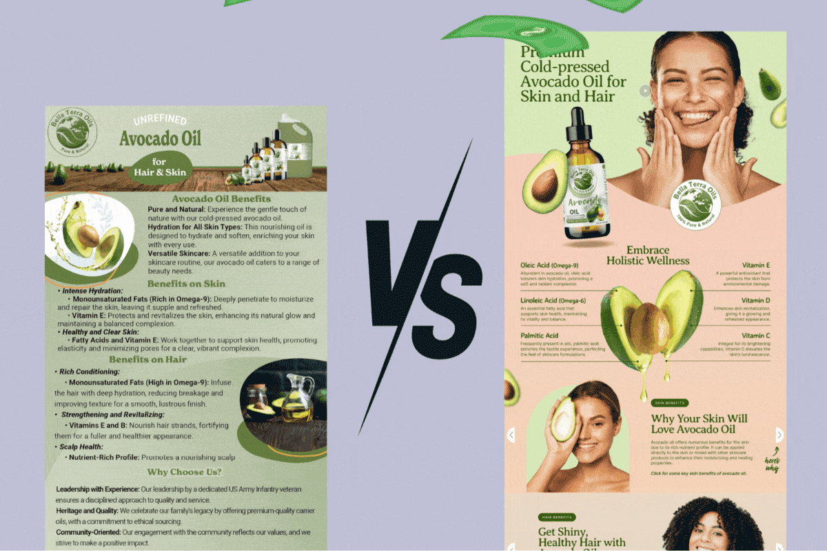
Amazon A+ Design: Use High-Quality Product Images
You’re sure to be familiar with the adage, “A picture is worth a thousand words.” On Amazon, a picture could actually be worth thousands of dollars in sales— if it’s done right.
High-quality product images are everything. They not only increase page views but also play a key role in buying decisions. They’re the first thing customers see and often give that final push to check out.
Blurry, poorly lit product photos induce doubt about authenticity or lead to a loss of trust. Meanwhile, sharp, clear images reassure customers that what you're selling is the real deal and that you're trustworthy.
Now, let’s talk image strategy. You want to showcase your product in all its glory, and you can do this when you:
Feature Close-Ups That Sell
Zoom in on what matters. Highlight key product details—like the smooth leather texture on a bag, belt, or wallet, or the intricate stitching on a jacket. Close-up shots give customers a better sense of quality and craftsmanship, helping them feel more confident in their purchase.

Show Your Product in Action
Let customers see how your product fits seamlessly into their lives. A cozy blanket casually draped over a couch or a sleek coffee machine brewing the perfect cup of joe can turn a simple product into a must-have essential.

Capture Multiple Angles
Give customers a complete view of your product by showcasing it from multiple angles. The more details they see, the more confident they’ll feel about hitting that "Add to Cart" button.
Be Consistent
Ever come across listings with mismatched lighting or awkward Photoshop edits? Big mistake. Keep your images consistent—same background, lighting, and angles—to maintain a polished, professional, and on-brand look that builds trust with shoppers.

Keep your Amazon A+ Content Clean and Clear
No one enjoys scrolling through a webpage that looks like it was designed by someone who LOVES chaos. When it comes to Amazon A+ content, less is definitely more.
A cluttered design is like trying to read a novel while someone shouts random facts at you—it’s distracting and exhausting. If your buyers get confused by too much information or poorly arranged elements, they’ll bounce right off your page faster than you can say “add to cart.”
To avoid scaring people away, focus on visual hierarchy.
The key here is to structure your content so that the most important information stands out first.
Guide Customers with Clear Headings
Break up sections with structured headings to create a logical flow. A well-organized layout helps customers navigate your product’s features and benefits effortlessly.

Use White Space to Keep It Clean
Give customers visual breathing room with thoughtful white space. It’s not wasted space—it’s the digital equivalent of a coffee break for the brain, making your content easier to absorb.

Keep It Scannable, Not Overwhelming
Avoid the dreaded wall of text—nothing loses a buyer’s attention faster. Break things up with visuals, icons, and concise product descriptions. Keep text short, punchy, and easy to scan, ensuring even the quickest shoppers get the message instantly.

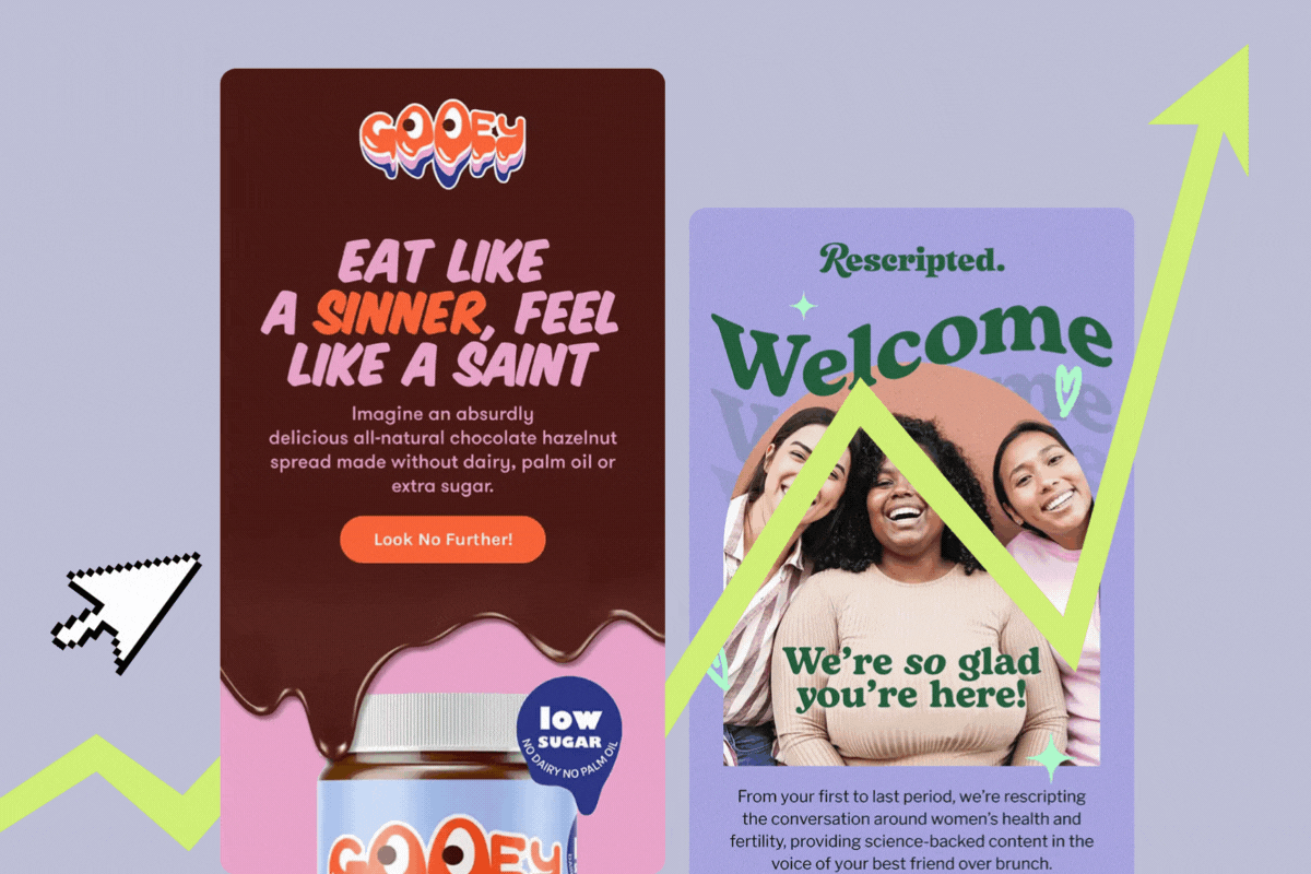
Use Colors that Reflect Your Brand
Think of color as the emotional trigger in your Amazon listing design project. Colors can make us feel calm, excited, hungry, or even ready to splurge—which is why color psychology plays a major role in A+ content design.
A good example is the color red, which is often associated with urgency and can encourage people to make quick (think, impulsive) decisions. Blue, on the other hand, is typically associated with trust and reliability. By familiarizing yourself with the psychological impact of colors, you can utilize them more effectively to influence buyer behavior.
But let’s not get too wild with the color wheel.
Stick to Colors that Reflect your Brand Identity
When selecting colors for your A+ Content, choose shades that align with your brand’s message. For example, if your brand is eco-friendly, earthy tones or greens will resonate more than neon pink. Staying true to your brand colors creates a cohesive, authentic feel that customers can connect with.
Keep Your Branding Consistent
Stick to your brand’s color palette to create a seamless connection between your Amazon listing and your overall marketing. A cohesive look builds trust and makes your product feel like part of a larger, recognizable brand.
Maximize Contrast for Optimum Effect
The high contrast between your text and background is what makes your content easy to read (and products easy to buy). Think bold white text on a dark background or vice versa. You also want contrast in key areas like headlines, icons, and any important visuals. If the important information blends into the background, you’ve already lost the sale. So, make sure the elements pop. A good rule of thumb? If it’s easy on the eyes, it’ll be easy on the wallet.
Choose Fonts that Convert
Fonts might seem like an afterthought, but they’re an essential element of A+ content design. Choosing the right font can mean the difference between looking like a professional seller or an amateur DIY enthusiast.
Choose Fonts That Mean Business
Keep it clean and professional with simple, easy-to-read fonts. Skip the overly decorative styles—this isn’t a wedding invite or a birthday card. The goal is clarity, not confusion.
Prioritize Readability on All Devices
Your fonts should be crystal clear on desktops, tablets, and mobile screens alike. If customers have to squint to read your listing, they’ll move on—so keep it sharp and legible everywhere.
Make Text Easy to Read
Use larger fonts for headings and subheadings, and keep body text comfortably readable. Proper point size and spacing ensure a smooth reading experience—because no one wants to struggle through cramped, tiny text.
Stick to One or Two Fonts
Too many fonts create visual chaos—think stripes, polka dots, and plaid all at once. Stick to one or two complementary fonts to keep your A+ Content looking clean, cohesive, and professional.
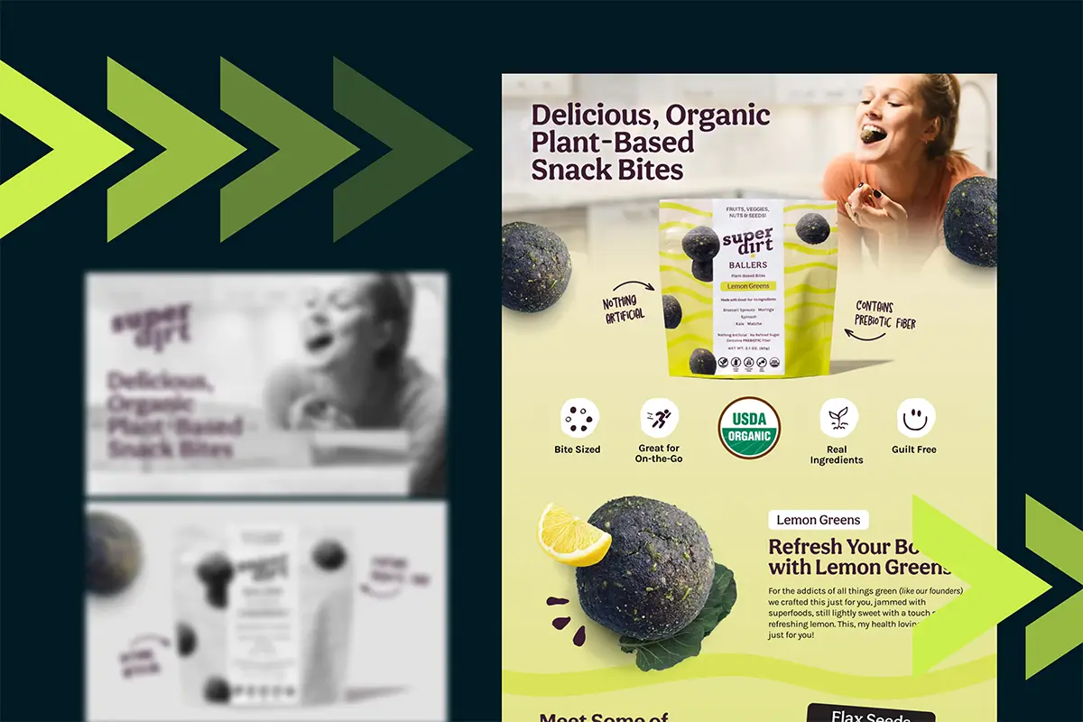
Harness the Power of Infographics and Visual Storytelling
You know that feeling when you’re reading something super technical, and your brain checks out halfway through? Yeah, your customers could be feeling the same way. That’s why visual storytelling and infographics are absolute game-changers for Amazon A+ content. Why overload your audience with text when you can show them what your product does in a quick, digestible image?
Enhance Communication with Smart Visuals
Simple design elements like arrows, icons, and charts can turn basic images into powerful selling tools. These quick visual cues highlight key features at a glance, making it easier for shoppers to absorb information without sifting through heavy text.

Turn Information Into Eye-Catching Infographics
Complex details? Make them visual. Infographics break down product specs, comparisons, and key features into an easy-to-digest format. They’re engaging, scannable, and far more fun to absorb than a block of text.

Implement Mobile-first in Your Amazon A+ Content Design
The era of desktop-only shopping is long gone. These days, shopping on the go is the norm. This means your customers are putting items in their virtual carts while binge-watching their favorite show, standing in line for coffee, or waiting for their ride. In fact, a whopping 72% of consumers use mobile devices to shop online. If your Amazon A+ content isn’t optimized for mobile, you’re essentially turning away over half of your potential customers.
Ensure your A+ Content shines on Any Screen
Doing so ensures that images, fonts, and layouts scale down seamlessly without looking squished or distorted when people switch from computer or laptop screens to mobile phones or tablets.
Optimize for Mobile Viewing
Since you can’t create a separate mobile version of your images (unless you have Premium A+), it’s crucial to ensure your text and visuals are easy to read on smaller screens. Keep text large and clear, avoid overcrowding images with details, and make sure key information stands out at a glance. Mobile shoppers don’t have time to pinch and zoom—so design with clarity in mind.
Got Access to Amazon Premium A+ Content?
If you’re a seller with access to Amazon Premium A+ content—congrats! You’ve just unlocked the VIP section of product listings. And with this fancy upgrade comes some serious game-changing features, like videos, hover hotspots, and clickable carousels.
Videos
You can highlight key product features, explain how the item works, and build trust by giving customers a 360-degree product view. And don’t even get me started on how much faster videos convey info (hello again, people with attention spans of goldfish!). But here’s the kicker: Good design matters here, too. Keep videos short, sweet, and focused—people aren’t here for a Hollywood production; they just want to know why your product is better.
Hover hotspots
This nifty little feature is designed for shoppers who love to poke around and learn about every minute product detail. With hover hotspots, customers can hover over a specific section of the product image and see a pop-up with more info. However, use these hotspots wisely, as it’s ill-advised to overload an image with pop-ups. Instead, place them strategically to highlight key details, like the material used, available sizes, or unique product benefits.
Clickable Carousels
These allow you to showcase multiple images (or even different product versions) in one spot. They can also keep your listing looking clean and uncluttered. Shoppers can swipe through carousels at leisure to get a full product picture without feeling overwhelmed.
Pro tip: To qualify for A+ Premium Content quickly, you can modify and resubmit your existing approved A+ Content. Instead of needing approvals on five unique product listings, gaining five total approvals across any A+ Content will work. Many Amazon experts suggest this technique to expedite access to A+ Premium features—make minor updates to your current content, resubmit, and repeat until you reach the five approvals needed. This efficient approach helps you unlock premium capabilities sooner.
Design Like You Mean Business
When it comes to Amazon A+ content, the devil is in the details. Every design choice—from the images you select to the fonts you use—can either make or break your product page. A clean layout, high-quality visuals, the smart use of color, legible typography, and responsive design—this formula is your golden ticket to turning scrollers into buyers.
Looking for an Amazon Design Expert?
Need to add a bit of "je ne sais quoi" to your Amazon listings? Look no further - an expert is here!
get startedAmazon Graphic Design Services: What You’re Really Paying For
Amazon
Amazon Graphic Design Services: What You’re Really Paying For
read more
Creative Email Designs: Best Practices and Tips for Higher Conversions
Email
Creative Email Designs: Best Practices and Tips for Higher Conversions
read more
How to Qualify for Amazon Premium A+ Content—Fast
Amazon
Quick Bits
How to Qualify for Amazon Premium A+ Content—Fast
read more

Lorem ipsum dolor sit amet, consectetur adipiscing elit. Suspendisse varius enim in eros elementum tristique. Duis cursus, mi quis viverra.