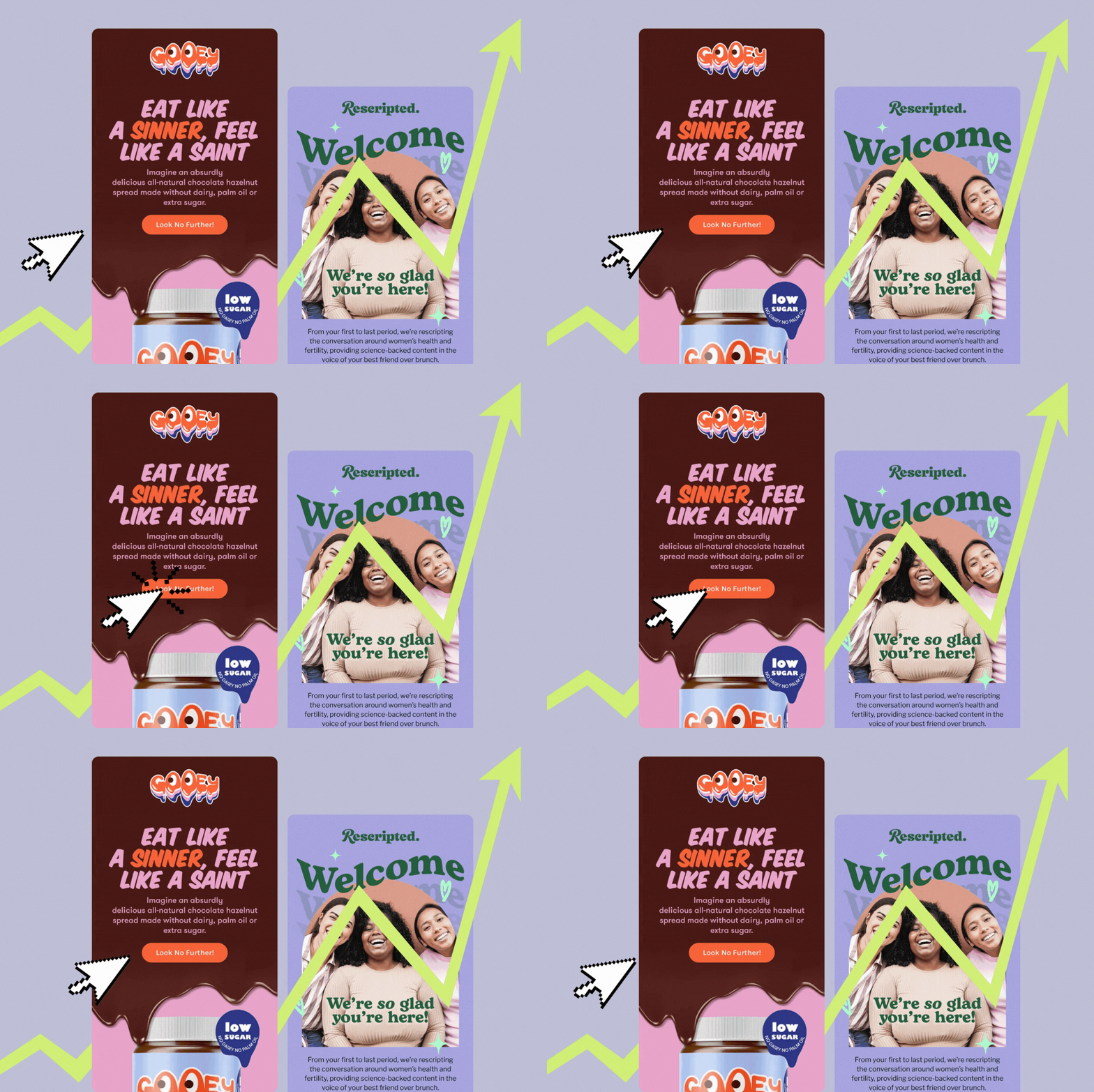
Email is the holy grail of marketing. It gives you complete control to say what you want when you want. Websites depend on people to visit them. Social media pages depend on the platform that hosts them. But email? Email gives you a direct connection to every single person on your subscriber list.
The brains who do research have found that 50% of consumers buy something from a marketing email at least once a month. Marketing emails– when done right– are good for your business.
Getting the most from your emails can be tricky, though, even the best of us make email marketing mistakes from time to time. Here are 4 of the most common flubs and the best way to avoid each one.
Mistake #1: Skipping mobile optimization
Whether you admit it or not, you probably spend a lot of time on your phone. When you wake up in the morning and start working through your notifications, what’s one of the first places you check?
Well, if you’re like 98.5% of people, you check your email. You check it again before you start work, check it another 27 times throughout the day, and basically pick up your phone the moment you hear the ding of another email.
These days, more emails are opened on mobile devices than computers– 60%, in fact. If your emails aren’t reading well on a phone or tablet, you’re losing a large chunk of your audience.
What to do instead:
Before you press send, double check the mobile formatting for your emails. We’re in the day and age where most email platforms automatically optimize for mobile (like my one true love– Klaviyo) but you should still take a quick look at the mobile version to ensure everything appears the way you want it.
If your email platform doesn’t allow you to check mobile optimization, just go old school. Send a test email to your personal email address and look it over before you send it to your entire list.
Mistake #2: Not using your email platform to its full potential
You’re using your platform to send one-off emails you write, but do you have automated emails triggered by certain actions?
An abandoned cart email can attract up to 10% of shoppers who didn’t complete their order.
The average open rate for an email is 21%, but that number jumps to 82% for a welcome email.
Of course, those emails can’t work if you don’t have them set to send at specific points.
What to do instead:
Invest the time in setting up email sequences for different scenarios. A welcome sequence for new newsletter subscribers. A thank you and follow-up sequence that sends after a purchase. A re-engagement sequence if someone has stopped opening or interacting with your emails. Communicate with your subscribers where they are in their sales journey, because they’re all going to be at wildly different places.
PS– If you feel overwhelmed by the thought of setting up several email sequences or just don’t have the time, I know someone who can take that off your plate! (It’s me. 😎 I can help you build email flows in Klaviyo.)
Mistake #3: Not providing value to your audience
You know those students who scream “Pick me! Pick me!” while they wave their hands in the air and the teacher basically ignores them? That’s you if you only ever send emails focused on how badly you want a sale.
Don’t be a pick me kid.
What to do instead:
Use your emails to build a relationship with your readers by providing a mixture of content. What information should be landing in your subscribers’ inboxes?
- Sales & promotions
- New products/launches
- Weekly/monthly newsletters
- Video & podcast links
- Personal updates
You can make it easier on yourself by following a set email schedule. Send new product updates at the beginning of the month, newsletters every Tuesday, and sales promotions every other Thursday. (Or whatever a great content calendar looks like for you.) Sticking to some sort of schedule holds you accountable for staying in regular contact with your readers and providing a variety of content to them.
Mistake #4: Not looking professional
Your audience is learning to trust you– to them, you’re just a name on the internet. If your emails look like you threw them together in 2 minutes flat, readers are going to have some serious doubts about the quality of the product or service you offer. In this instance you do have something to prove.
Typos, poor formatting, and substandard images will cost you your audience’s trust and ultimately their sales.
What to do instead:
Get professional help. There are a few ways you can do this. You can consult with a graphic designer to learn strategies for email design. Of course, if you want to save yourself some time and possible headaches, consider investing in email design services.
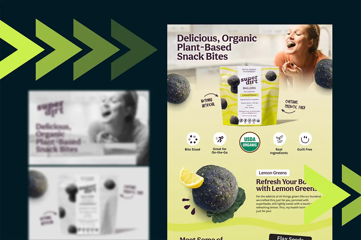
I provide clients with responsive email designs that drive sales– you can find samples of my work right here.
Let’s get your emails cracking
Ready to kick butt with your marketing emails? I’ll wear my steel toe boots.
Drop a line here so we can talk about—
- Custom designed emails
- Email design best practices
- Custom templates for Klaviyo flows
Looking for an Email Design Expert?
In search of a wizard who can make your emails look magical? Look no further - your email design expert has arrived!
get started


Lorem ipsum dolor sit amet, consectetur adipiscing elit. Suspendisse varius enim in eros elementum tristique. Duis cursus, mi quis viverra.