Can we have a heart-to-heart about something that's been bothering me? Let's talk about Google Fonts.
Now, I know they're free and all, but as your trusty designer, I have a confession to make: I have a love-hate relationship with them. Sure, they're convenient and cost-effective, but let's be real: they lack something special that makes your brand stand out.
As a graphic designer, I've always thought of typography as our secret superpower. It can express emotions, build brand identities, and shape how people interpret messages. In short, it gives any design that much-needed "kapow!" Over the past decade, Google Fonts has become a go-to resource for businesses and designers, offering a treasure trove of typefaces that are free, accessible, and a breeze to use. But like any popular tool, there's a downside to its ubiquity.
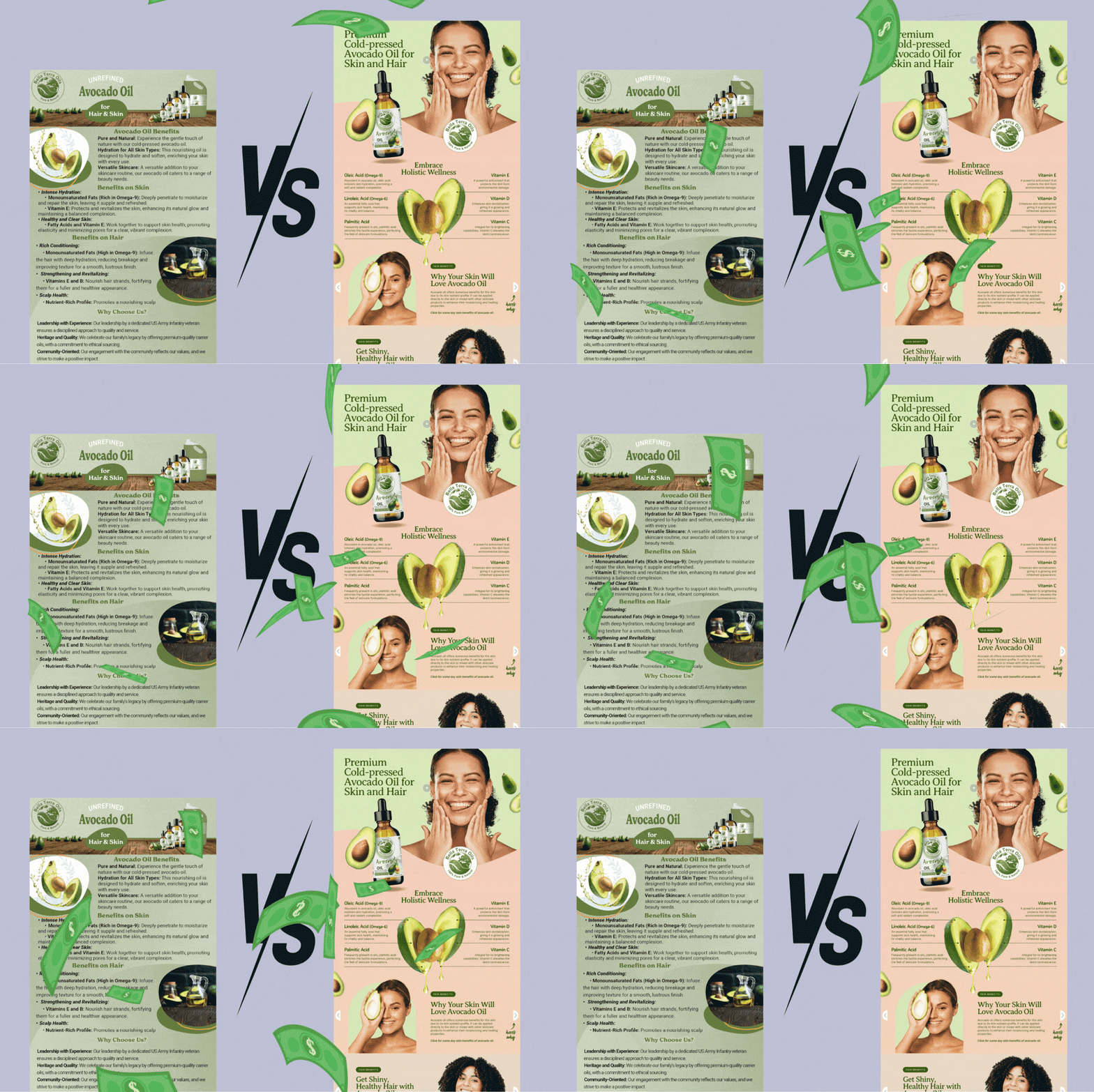
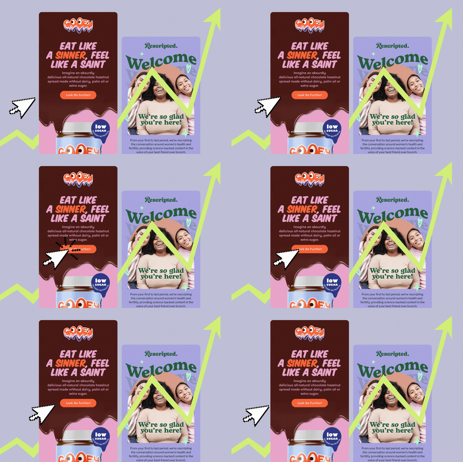
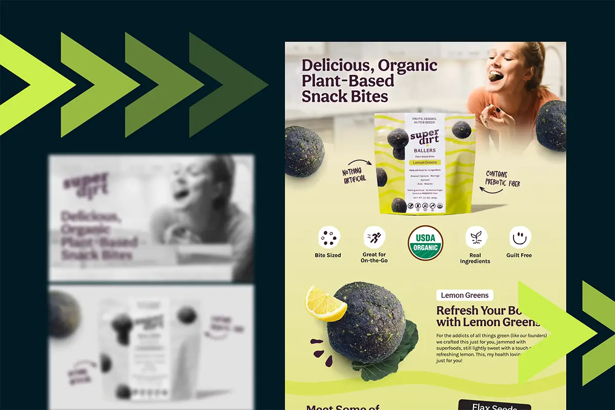
The overuse of typefaces like Roboto, Poppins, Open Sans, Lato, and Montserrat has resulted in design homogenization, making websites and designs look all too similar. It's like when you're shopping for a new car, and suddenly, you see that model everywhere on the road. The same thing happens with Google Fonts. Once you notice them, you can't stop spotting them— everywhere— you'll see, trust me.
In this blog post, I'll go into the reasons behind this phenomenon, shine a light on Google Fonts' shining moments, and sprinkle in some alternative resources and strategies for discovering unique and impactful fonts.
Why Your Font Choice Matters
In the world of graphic design, the choice of font is more than a matter of aesthetics; it's a powerful tool that can significantly influence the perception and effectiveness of a message. Fonts are the voice of the text, conveying tone, mood, and emotion, and they play a crucial role in how a brand or message is received by its audience.
Here are some reasons why font choice matters:
Communicates Brand Identity
Font choice is integral to conveying a brand's identity and can impact a design's overall look and feel. For instance, a tech company might choose a sleek, modern sans-serif font to suggest innovation and simplicity. In contrast, a luxury brand might opt for a classic serif font to evoke elegance and tradition. The right font can instantly communicate the essence of a brand, helping to build a strong and recognizable identity.
Evokes Emotional Responses
Different fonts evoke different emotional responses. For example, a playful script font can create a sense of fun, perfect for a children's brand or a casual event invitation. In contrast, a strong, bold typeface can convey power and urgency, making it ideal for headlines or advertisements. By selecting fonts that align with the desired emotional tone, you can enhance the impact of their message and create a deeper connection with the audience.
Establishes Visual Hierarchy
Fonts are crucial in establishing a clear visual hierarchy, guiding the viewer’s eye through the content in an organized manner. Using different font sizes, weights, and styles helps highlight important information and makes content easy to navigate. For example, a bold, large font can be used for headings, while a lighter, smaller font can be used for body text. This structured approach makes the design aesthetically pleasing and, more functional, and effective in communicating the message.
Creates Consistency and Professionalism
Consistency in font choice across all brand materials helps build a cohesive and professional brand image. For example, Apple uses its proprietary font, San Francisco, across its products, marketing materials, and interfaces, creating a unified and recognizable look. This consistency reinforces brand recognition and trust. A consistent typographic approach shows attention to detail and a commitment to maintaining a professional appearance, which can significantly enhance the brand's credibility.
The Ubiquity of Google Fonts
When Google Fonts launched in 2010, it was a game-changer for web and graphic designers. Before its inception, high-quality typefaces were often expensive and difficult to license for web use. Google Fonts democratized typography, providing a library of fonts that could be used freely across both print and digital media. This accessibility was revolutionary, but it also came with a cost: overuse.

The Most Overused Google Fonts
Certain typefaces from the Google Fonts library have become omnipresent to the point where they are immediately recognizable and often feel stale. Fonts like Roboto, Raleway, Open Sans, Lato, and Montserrat are fantastic in their own right— well-designed, versatile, and legible. However, their strengths have led to overuse, making them appear in everything from corporate websites to indie blogs, creating a monotony.
Roboto: The Android Default
Roboto, designed by Christian Robertson, is a digital design staple, notably as Android's default typeface. Its clean, modern appearance and wide range of weights offer versatility. Yet, its omnipresence has led to it being associated with a generic tech aesthetic. What was once sleek now feels unimaginative.

Open Sans: The Go-To Neutral
Steve Matteson's Open Sans is celebrated for its readability on screens, prized across diverse applications for its neutral, unobtrusive design. However, its widespread use has made it nearly invisible. With Open Sans adorning everything from e-commerce sites to nonprofit newsletters, its neutrality becomes less a deliberate choice and more a safe fallback, lacking the distinctiveness that makes a design memorable.

Lato: The Friendly Typeface
Created by Łukasz Dziedzic, Lato is celebrated for its friendly and warm appearance. Its rounded, humanist letterforms and broad weight range offer versatility. Yet, Lato's allure wanes through overuse. Its once-refreshing charm risks blending into digital noise. When numerous websites and brands rely on Lato, its capacity to stand out and convey personality diminishes.

Montserrat: The Geometric Darling
Julieta Ulanovsky's Montserrat draws inspiration from the old posters and signs in Buenos Aires' Montserrat neighborhood, boasting a geometric style and extensive weight range, making it a favored option for contemporary designs. However, its widespread popularity has resulted in overuse. From trendy startups to tech blogs, Montserrat's once-distinctive geometric forms have become commonplace, diminishing their unique flair. As a result, its inclusion in designs can now evoke a tired trendiness rather than fresh innovation.

Poppins: The Modern Minimalist
Poppins, developed by Indian Type Foundry, is known for its geometric simplicity and multilingual support, making it a top pick for minimalist aesthetics. However, its widespread adoption now poses a challenge. With its prevalence in numerous designs, Poppins' once-fresh appeal risks becoming overly familiar. The minimalist charm of Poppins may transition into monotony when it dominates the landscape of design projects.

When Google Fonts Work
Despite their overuse, Google Fonts can be the perfect choice in some situations. They are particularly valuable for projects with limited budgets, where paying for premium fonts is not feasible. They are also ideal for digital products that require web fonts that are easy to implement and render well across different devices and screen resolutions. For example, Google Fonts like Roboto and Open Sans are excellent for user interfaces and content-heavy websites due to their screen readability and extensive character sets.
Limited Budget
Google Fonts are an excellent choice for those on a limited budget. With a vast collection of high-quality, free-to-use fonts, they provide a versatile range of styles to suit any project. Whether you need something modern, classic, playful, or professional, Google Fonts offers a plethora of options without costing a dime.
Accessibility and Legibility
One of the strongest arguments for using Google Fonts is their focus on accessibility and legibility. Fonts like Open Sans and Roboto have been meticulously designed to ensure readability on screens, making them ideal for user interfaces and content-heavy websites. When the primary goal is to ensure that the text is easily readable, these fonts can still be the best choice.
Consistency Across Platforms
For brands that need to maintain consistency across multiple platforms and media, Google Fonts offer a reliable solution. Their extensive character sets and the availability of different weights and styles mean that designers can create a cohesive look without worrying about compatibility issues.
Exploring Alternatives
While Google Fonts have their place, the world of typography is vast and rich with alternatives that can bring a fresh and unique touch to your designs. Here are some strategies and resources for finding typefaces that stand out:
Independent Foundries and Designers
There's a wealth of independent type foundries and designers out there, pouring their passion and creativity into crafting innovative and high-quality typefaces. These fonts often come with a price tag, but the investment can be a testament to the distinctiveness they bring to a project, and a way to show appreciation for their craft.
Klim Type Foundry
Based in New Zealand, Klim produces beautifully crafted typefaces that range from the elegant and understated to the bold and experimental. Their fonts, such as Calibre and Tiempos, offer a fresh alternative to the standard sans-serifs and serifs from Google Fonts.

Colophon Foundry
This UK-based foundry Colophon creates typefaces with a unique character and contemporary edge. Fonts like Aperçu and Mabry provide a distinctive look that can set a design apart from the crowd.

Future Fonts
Future fonts is a platform allows designers to buy and license typefaces that are still in development. It's a fantastic way to access cutting-edge fonts and support type designers early in their creative process.

Lineto
Lineto is known for its innovative and high-quality typefaces, Lineto offers fonts that can bring a unique and modern edge to your designs. Their collection includes distinctive fonts like Circular and Brown, perfect for projects that need a contemporary feel.

Pangram Pangram Foundry
Pangram foundry is known for its versatile and modern typefaces. Fonts like Neue Montreal and Editorial New offer fresh, stylish alternatives to the standard options available on Google Fonts.

Grilli Type
A Swiss type foundry, Grilli Type produces high-quality typefaces with a modern touch. Their fonts, such as GT America and GT Walsheim, are known for their distinctive and clean designs, perfect for creating unique and professional-looking projects.

Kilotype
Kilotype offers contemporary and experimental typefaces that push the boundaries of traditional typography. Fonts like Monument Grotesk and Documan bring a unique flair to any design project.

HVD Fonts
Founded by Hannes von Döhren, HVD Fonts offers a range of typefaces that combine creativity with technical precision. Fonts like Brandon Grotesque and Pluto have become popular choices for their strong personality and high legibility.

Hoefler&Co
One of the most renowned type foundries, Hoefler&Co offers an extensive library of well-crafted typefaces that can bring a level of sophistication and polish to any design. Fonts like Gotham and Mercury are classics that provide both versatility and character.

Nicky Laatz
Nicky Laatz is a type designer known for her charming, hand-drawn fonts like "Hello Sunshine" and "Summer Loving." Her whimsical styles add a personal touch to branding, invitations, and social media graphics, making her a favorite among designers and brands seeking unique and creative typography.

There are so many great font foundries and marketplaces out there, but those are just to name a few!
Premium Font Libraries
For those willing to invest in their typography, premium font libraries offer a wide range of high-quality options. These fonts often come with extensive licensing options and support so that can be used across various projects and platforms.
Creative Market
Creative Market is a font paradise, offering a wide range of high-quality typefaces from independent designers and foundries worldwide. Whether you're looking for elegant serifs or playful scripts, Creative Market provides a platform for font creators to showcase their talent while fostering a vibrant community of typographic innovation.

MyFonts
MyFonts boasts a wide variety of typefaces from global designers and foundries. With its user-friendly interface, designers can effortlessly browse through a diverse collection to find the perfect font for any project.

Adobe Fonts
As part of the Adobe Creative Cloud subscription, Adobe Fonts offers access to thousands of high-quality typefaces. The library includes classic designs and contemporary innovations, ensuring there's something for every project.

Fontspring
This independent font retailer offers a range of fonts from various foundries, with a focus on fair licensing. Fontspring's library includes both widely known and unique typefaces, providing plenty of options for designers looking to break away from the Google Fonts norm.

Custom Typography
Custom typography can be the ultimate solution for brands looking to make a significant impact. Commissioning a bespoke typeface ensures that no other brand will have the same visual identity. While this option can be costly and time-consuming, the results are often unparalleled in terms of uniqueness and brand alignment.
Here are some custom fonts by some big brands you might have seen but not noticed they were custom:
Netflix Sans: Developed by Netflix, Netflix Sans is a custom typeface designed to establish a consistent visual identity across its platform. It is optimized for readability on screens and is used extensively in Netflix's branding and user interface.

Google Product Sans: Created by Google, Product Sans is a modern, geometric sans-serif typeface used across various Google products and services. Its clean, rounded design reflects Google's minimalist design aesthetic.

Duolingo Feather Bold: Feather Bold is Duolingo's custom typeface designed to be playful and educational, reflecting the brand's mission to make language learning fun and accessible.

Apple San Francisco: San Francisco is Apple's proprietary font designed for its operating systems, including iOS, macOS, watchOS, and tvOS. It is characterized by its clarity, legibility, and versatility across different screen sizes and resolutions.

Instagram Sans: Instagram's custom font is used across their app and marketing materials. It reflects the platform’s modern, vibrant, and user-friendly aesthetic.

Amazon Ember: Utilized in Amazon’s Kindle e-readers, Fire tablets, and across its websites for a consistent and readable user experience.

Practical Tips for Choosing Fonts
When selecting fonts for a project, whether sticking with Google Fonts or exploring alternatives, consider the following tips to ensure your typography enhances your design:
Understand the Project's Needs
Different projects have different requirements. A corporate website may need a clean, professional font, while a creative portfolio might benefit from something more expressive and unique. Always start by understanding the specific needs of your project.
Pair Fonts Wisely
Font pairing is an art. Combining typefaces that complement each other can create a harmonious and dynamic design. Tools like FontPair and Typewolf can help you discover great font combinations, whether you're using Google Fonts or other typefaces.
Consider Readability
No matter how beautiful a font is, it must be readable. Consider the context in which your text will appear and ensure that your font choices maintain readability across different devices and sizes.
Test in Context
Always test your chosen fonts in the context of your design. What looks good in a type specimen may not work as well in a real-world application. Mock up your designs and view them on various devices to ensure your typography holds up.
Conclusion: Beyond the Familiar
Google Fonts have undeniably democratized access to typography, making high-quality fonts available to designers and developers around the world. However, the widespread use of certain typefaces has led to a homogenization of design that can stifle creativity and innovation.
By seeking out independent foundries, investing in premium type libraries, and even considering custom typography, you can infuse your designs with originality and distinction. Typography is more than just a functional element; it's a critical component of visual communication that can set a design apart and convey a unique voice.
In a world overflowing with the same tired fonts, let's dare to find typefaces that truly showcase our project's unique flair. Next time you're about to grab Montserrat or Poppins, take a breather and explore some alternatives. Who knows? You might just discover a new font that breathes new life into your brand like never before.
Looking for a Creative Graphic Designer?
Need a bit of flair for your brand? Search no more - you've just found the perfect graphic designer!
get started


Lorem ipsum dolor sit amet, consectetur adipiscing elit. Suspendisse varius enim in eros elementum tristique. Duis cursus, mi quis viverra.