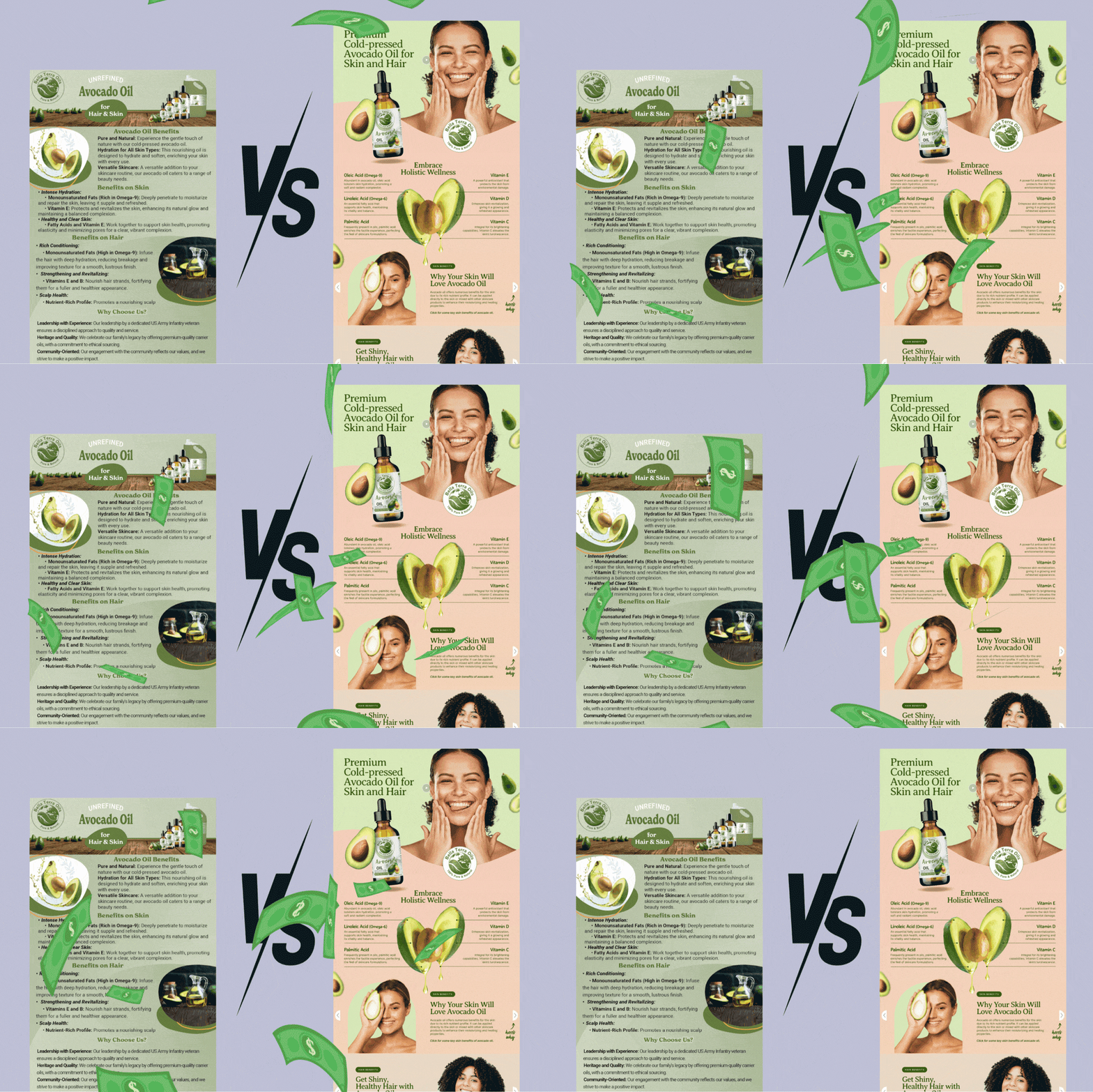
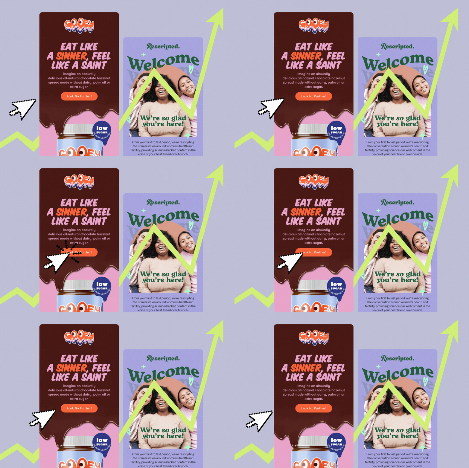
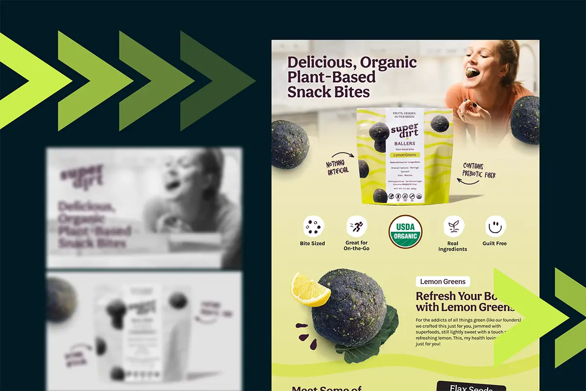
10 years ago, Gangnam style was the hottest music video of 2012. 5 years ago, fidget spinners took the world by storm. It leaves you wondering what 2022 trend we’re going to look back on and think, ‘that was what was popular?!’
Not only do trends come and go, but the volume of human knowledge doubles approximately every 12 hours. Our world is constantly changing, and if you want your business to thrive, you have to change with it. There’s a reason
Adapting to the changing times doesn’t mean you’ve got to rewrite your business plan every 7 years (no thank you!), but if you want to stay ahead of the curve, you do have to to keep your website in top-notch condition. Unsure if it’s time to start looking for website redesign services? Let’s look at a few signs your site is ready for a change.
1. It doesn’t reflect your brand aesthetics
Maybe your branding has changed since you launched your online presence three years ago, or maybe you didn’t even have concrete branding when you started. Either way, here are a few features that should be consistent throughout your website–
- brand colors
- brand font
- updated logo
- imagery and graphic style
- mood
All of the best brands evolve over time, and that includes yours. Make sure every aspect of your website reflects the most recent branding decisions you’ve made– from the font of your CTA buttons to the images you include in your blogs.
2. It looks like your competitors
It happens to the best of us. You go to look at what others in your field are doing, and you become inspired. Before you know it, your sites have become fraternal twins– not exactly the same, but close enough that you can tell they’re related.
Trying to fit in is a goal best left to high schoolers and wanna be influencers. The best way to attract– and retain– your target audience is to be different from businesses in your industry. Being unique is highly underrated.
3. Your analytics say so
Low conversion rate– less than 3%.
High bounce rate– greater than 60%.
Short session durations– less than 2 minutes.
Look for metrics indicating that your website is helping you achieve your business goals. If you’re seeing unfavorable numbers from your site analytics, a professional will be able to pinpoint where your current design is falling short.
4. It’s not mobile friendly
If for any reason your website isn’t mobile friendly, it’s time to talk. It’s 2022. You need to expect that the majority of visitors are going to be people on their phones. Target those people. Plan for those people. Optimize for those people.
What does that look like for your specific website builder?
- Shopify provides a number of mobile ready responsive designs.
- Weebly automatically optimizes sites for mobile and allows you to make changes.
- WordPress plugins are available to make your site mobile friendly.
- Squarespace templates are designed to be mobile friendly.
- Webflow provides flexbox layouts that make it easy to optimize for mobile.
Take the time to research how your platform optimizes for mobile visitors and make changes to your site as you need.
5. It hasn’t been updated in a hot minute
Having a website is a little bit like owning a house. You make small tweaks here and there– you reword some copy and update images every few months. But eventually, you get to the point where it’s time to gut the whole thing and start fresh.
No one can agree on exactly how often you should redesign your entire site. Some say every 18 months, but others say you can wait up to 5 years.
6. It’s not accurate
Inaccurate information on your website will 100% cost you sales.
- No one wants to hunt down correct information. If people can’t find out what they need to know right away, they’re going somewhere else.
- People don't trust a company who doesn't provide accurate information from the start.
Believe me when I say I know running a business keeps you busy, and when you’re putting out one fire after another, making changes to your website is low on your list of priorities. But anytime your business changes, your website should change too.
Start by checking technical accuracy. Do all of the links work? Does every page load?
Then, look at the business details. Is the phone number and email correct? Does any pricing reflect your latest rates?
Finally, consider messaging. Are you still targeting the correct audience? Does your copy reflect the language you use for your brand?
7. Visitors have a poor experience
A poor user experience can happen for any number of reasons. Hard to read font. Confusing site navigation. Slow loading time. Now, your audience probably isn’t sending you emails listing the issues they have with your website, so how do you figure this out?
Simple– have someone you trust visit your website. To make it easier, provide a checklist of questions for them to answer as they look through the site, including
- Did all the pages load within a few seconds?
- Do you understand what products/services we offer based on our site?
- Was everything easy to read and understand?
- Was the site pleasant to be on?
- Would you trust our company?
8. Your current site doesn’t utilize SEO
Contrary to what someone posts on LinkedIn at least once a day, SEO isn’t dead, and it’s not going anywhere. You should be able to utilize title tags, alt tags, custom page urls, and H1, H2, H3 tags, as well as a blog for content marketing. If your current site doesn’t allow you to use all of this then it’s time for an upgrade.
Is it time to look for some website redesign services?
If your website is showing signs of needing a refresh, I’d love to help you get started. Shoot me a message and we can chat about your needs.
Looking for a Creative Graphic Designer?
Need a bit of flair for your brand? Search no more - you've just found the perfect graphic designer!
get started


Lorem ipsum dolor sit amet, consectetur adipiscing elit. Suspendisse varius enim in eros elementum tristique. Duis cursus, mi quis viverra.